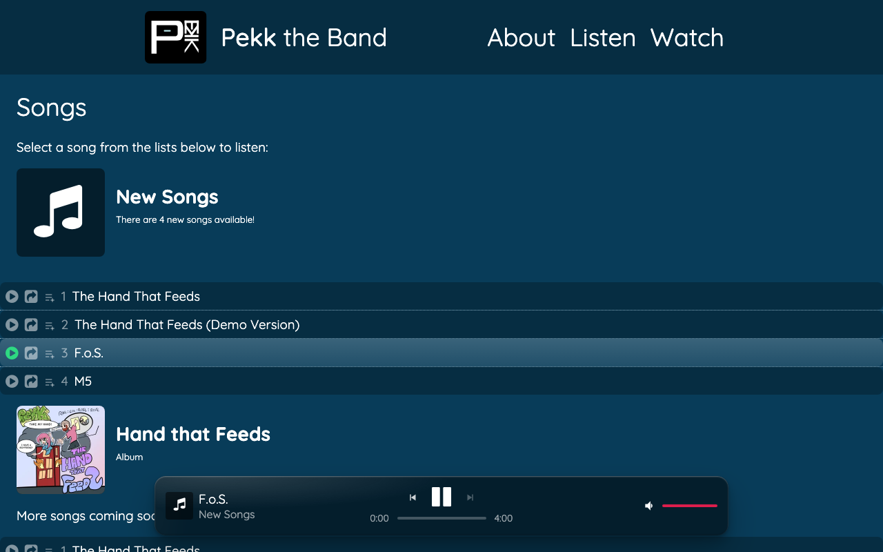
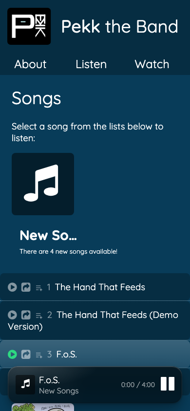
The player bar at the bottom of the site (the one that shows up once you hit play on a song) got a redesign. A few things are different:
It floats now, instead of sitting flush against the bottom edge. Rounded corners, a frosted-glass blur, a little breathing room below it.
Desktop:
Mobile:
It bounces in. The first time you hit play, the panel springs up from the bottom instead of just appearing.
Long song titles scroll now. If a title’s too long to fit (looking at you, “Ain’t No Point (feat. Cousin Dew)”), it marquee-scrolls instead of just getting cut off with ”…“.
Same player, same controls underneath - just easier on the eyes.